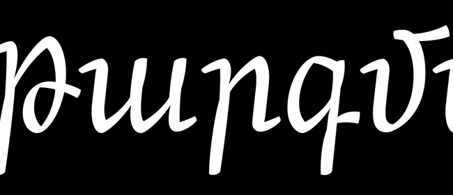
Interview: Khajag Apelian
Khajag, warm congratulations on winning the Grand Prize in the Granshan 2010 competition! I was fortunate to be on the jury, and felt even more fortunate that we could award the top prize to an Armenian typeface.
Thank you very much!
Are you surprised you won the Grand Prize? Modesty is optional.
Well, honestly I am surprised. I wouldn’t have been that surprised if it were one of the regular prizes, but the Grand Prize was out of my expectations, especially that the competition comprised Greek and Cyrillic scripts besides Armenian. This is a remarkable start for my career, and I would like to thank the Granshan committee for granting Arek the Grand Prize.
Arek was developed as part of your studies at the Royal Academy of Art in The Hague, under the tutelage of some of the top typographic minds. How much of the credit do they deserve?
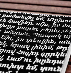 I didn’t have any experience in designing type before my studies at Type and Media, so definitely a big part of the credit goes to my instructors. During the first semester of the program, I was taught the basics of type design through practicing and exercising the principles of Latin type. Adapting these principles to the specifics of the Armenian script had to come from a more personal learning effort, so I took the time to research the Armenian script and build my own knowledge about its history and principles. At that time, I was also surrounded by my wonderful classmates who came from different academic and professional backgrounds, and they each provided encouraging feedback that helped bring Arek to life.
«Arek» means «Take that!» in Armenian. Was that intended as a jab at something?
Arek has many definitions; it means «sun», and it refers to the 8th month of the Armenian calendar – «March» in the international calendar. Arek is also the name of the theater group I was part of during my teenage years. But mostly, I decided to go for Arek because it sounds nice; it’s also short and easy to pronounce.
Some people see a regressive calligraphic flavor in Arek. What’s your take on that?
As you may already know, we do a lot of calligraphy at the academy. We spend a lot of time writing, understanding how the pen functions and how each tool affects the anatomy of the letters. This obviously had a big impact on the design process of Arek.
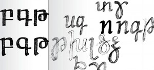
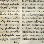
The process also consisted of a lot of research; I looked into Armenian calligraphy in order to understand the historic development of the Armenian script. And that’s when I came across a very beautiful book entitled «Album of Armenian Paleography» by Stone, Kouymjian and Lehmann. This book helped me study traditional Armenian writing styles like «Yerkatagir» and «Boloragir». In short, studying the calligraphic origins of the Armenian script helped me get a better grasp of how the script is structured, and therefore understand how to develop it further.
Now, the usage of the term «regressive» is subjective; for me the calligraphic feel of Arek is a choice that reflects my present-day understanding of the Armenian script.
What’s special about Arek?
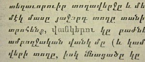
Arek was initially designed to be used in schoolbooks. I started by selecting 3 schoolbooks: one from the 3rd grade, another from the 8th and a third from the 11th. And I studied the type and the typography in these books. Which typefaces and sizes do they use? How do they manage the hierarchy of information? Etc.
I found out most of these books use a rather badly digitized version of the «Boloragir» script (AKA Barz), a style with a very modular structure and an extreme contrast. This creates a lot of confusion with some characters, making the reading unpleasant. Another thing I noticed was the lack of variation in styles and weights. Most of these books were using forced italics and bolds, which causes distortion and clogging in many letters. Arek answers all these needs. It has different weights and styles and allows a better hierarchy on the page.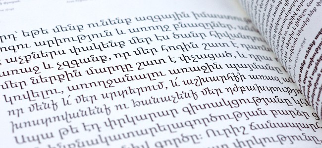
What do you feel about Italics in Armenian?
Despite the fact that traditionally, the Armenian script does have some styles which are cursive like the «Notragir» and «Sheghagir», italics in Armenian are not common practice. Many believe that differentiation within the script can be achieved through alternative ways. And although this is a debate that I would still like to delve further into, in the specific case of Arek I have opted for an Italic version. The schoolbooks that I studied do reflect a need for italics, which I decided to answer for through the Italic form of Arek.
What’s Arek’s future? Will you try to sell it? On your own or through a font house? Are you worried about armenopiracy? Will you be designing a Latin counterpart? Is that enough question marks?
Arek currently has two weights, a regular and a black, in two styles, upright and cursive. I think this demands at least another two intermediate weights with their cursive counterparts in order to achieve a better functionality. To reach a wider audience, I would also like to design a Latin counterpart for it, and maybe even a Cyrillic counterpart, since most of the communication systems in Armenia are still bilingual (Armenian/Russian).
And frankly, I still haven’t done much thinking regarding the logistics of sales. I am more concerned now with completing the kerning tables, expanding the family through additional weights and maybe even going for a sans-serif version. I am just hoping it won’t be a never-ending project!
Armenopiracy? Is that any different from worldopiracy…
So you’ve moved back to Beirut now. What are your prospects and emotions?
I have been living outside Beirut for around four years now. First in Dubai for one year, and then in the Netherlands, which I absolutely loved everything about! However, chance has brought me back to Beirut, and I am now in the process of setting up a graphic and type design studio with a friend of mine, Lara Balaa. The studio is called «Maajoun». Beirut has become quite a battlefield considering there are many design studios, both established and start-ups. But we are excited, and optimistic!
What do your parents think about what you’ve been doing and your future plans?
Since the beginning my parents were very supportive of my decision to study graphic design. At first, they had no idea what graphic design is, but with time they came to understand the different aspects of graphic design and my special interest in specific areas of the discipline, especially in type design. I am lucky to have parents who fully trust my judgments.
Now when I first decided to come back to Beirut instead of the UAE where they live, they were a bit worried. Beirut is politically unstable! But they also understood why I chose Beirut. The design scene here has a lot of potential, and I would like to take part in its growth. The political instability is part of the package… and as long as I have internet, my work does not have to entirely depend on the local market!
And how will you spend the Granshan prize money of ~2 million Lebanese Pounds? ;-)
Fast. :-)
Any parting words?
I would like to thank the Ministry of Culture of Armenia and the Typographic Society of Munich (tgm – Typographische Gesellschaft München) for their much-needed initiative in encouraging the development of the Armenian script.






congratulations khajag! knowing how hard you worked on this, you totally deserve the grand prize!
Congratulations, KJ! I am very happy for and proud of you!
Congratulations, KJ – clearly a lot of hard work!
What you do not know is that I showed a slide of your work in my presentation ‹Typography for a small country — Armenia› at the Dublin ATypI conference in September. I knew of your competition success by then (as one of the judges) but, frustratingly, wasn’t allowed to mention it.
Congratulations; loving the «մե» ligature.
Best regards,
SB
That’s a beautiful typeface, congratulations!
Congratulations! Keep up!
Congrast :)
Warm congratulations from me too! An impressive and likeable piece of work.
FWIW, one thing I’m finding quite interesting with Arek is that (perhaps not surprisingly :-) it seems to show a rather «Dutch» flavor in terms of its soft calligraphic execution, and also in the decidedly cursive structure of its paired Italic. If you feel like elaborating, I’d be curious to hear if it was a conscious decision on your part to «transpose» a certain «Dutch» approach from a Latin-based context to the Armenian script – and if so, why?
Indeed — for one thing the Black is very Underware.
hhp
Beautiful :)
And nice interview too. Congrats!
Congratulations to Khajag. The first time I saw his typeface Arek was maybe a year ago on the Type and Media 2008–2009 poster that the students put together, and I thought «this design is quite refreshing and innovative». And that is exactly the kind of thing the Armenian script and Armenian type design in particular has been lacking for a long time. Keep on going Khajag!
Congratulations KJ! Very nice work :)
Congratulations Son , we are very proud of you. keep going on ‚wish you more success in the future.
Love you
Shnorhavor ella :)! lavakouyn paremaghtoutunners abaka dzrakirnout
Go Khajag, so proud of you…
Thank you guys for all the lovely comments on Arek, I really appreciate your support.
To answer Nina’s question, it is indeed very interesting to trace back one’s conscious or unconscious influences as they reveal rich parts of interweaving history. Most of the early Armenian metal type was cut by European masters such as Robert Granjon and Johann Michael Fleischman. This obviously led to the introduction of western principles in Armenian type and printed books.
In my case, being a scholar of Type and Media and having lived most of my life in an Arab country, the influences that led to Arek are certainly numerous. I am not sure whether I could tell which is Dutch, Armenian, Arabic, conscious or unconscious. I hope I was able to answer your question. :-)
Khajag, thank you for the thoughtful reply.
To me cross-cultural migration is not only unavoidable, but desirable. The question in my mind has always been: Does it always have a good result? And if not, how do we control it? We can certainly prop up a culture via artificial protectionism — but who does that really serve? This of course is part of the Globalization debate (which is no longer the Flavor of the Month — is that still Global Warming, or is that over too?) where type has a quiet but powerful role to play.
Hmmm, sounds like somebody should write an article. ;-)
Khajag, warm thanks for getting back to that question!
To me this whole issue of interweaving cultural voices is deeply fascinating, both in its complexity and its cultural reverberations (and especially in type). It’s intriguing how Arek was designed by somebody «rooted» in so diverse cultural backgrounds, and brings them together to spark something new. That opens up both interesting possibilities and complex questions; like, what sorts of concepts/ideas can successfully be «transported» from one script / one culture to another; and how do they work in their new context? I’d certainly enjoy more discussion about these sorts of things, here or elsewhere. Thanks for sharing your thoughts. :-)
Khajo my brother & my friend!!
so proud of u, love u shad
Dear Khajag:
You are the answer to my prayers and probably others as well!
Since I immersed myself in the Armenian language, seven years ago, I found it very difficult to distinguish certain characters such as the գ, զ, դ, ղ, and շ. It is also funny sometimes when reading a text in front of people for the first time because some words exist with one or two close characters in common (i.e. շատ,զատ,դատ,գար,գառ…etc.)
As I am preparing a short version for our Armenian Mass and songs for children I believe AREK will be very appropriate. So I look forward to the availability of your font especially with the Latin counterpart.
Meanwhile, if you can recommend an appropriate type other than BARZ, I would be most appreciative.
Blessings always,
Michael
[…] delivering a high level of polish. This is very difficult to pull off, especially for a student. Apelian clearly has “the eye” and his KABK instructors surely played a role in quickly maturing his […]
2emulate…
…