Type and Culture
It could be said that Armenia is one of the world’s fastest disappearing nations as waves of emigration going back centuries gradually reduces the population. However, as an ethnic or cultural group Armenians maintain a strong presence in the world and over four million Armenians live outside of the country.
Throughout centuries of persecution, as the country shrank to ten per cent of its original size, Armenians have relied on their ancient language and culture to ensure the survival of their identity. Since the adoption of the specially-created alphabet 1605 years ago, most letters have remained unique and unchanged and Armenia’s alphabet is fundamental to her religion, language, literature and culture. Now that more Armenians live in other parts of the world than live in modern-day Armenia, the diaspora attempts to keep the culture and language alive and their unique alphabet is of course, key.
Although I’m not an Armenian, for a few years now I’ve concerned myself with the Armenian alphabet and type. I was first struck by the unusual forms and the fascinating story of its origins. I have dabbled with Armenian type design for a few years but in 2007 I tried my hand at «serious» type design and obtained research funding to design a typeface with both Armenian and Latin characters «Lagoon» – a revival of an Armenian metal type from late eighteenth century Venice.
Some Government officials in Yerevan call me their «ambassador» as I’ve been trying to raise the profile of the Armenian alphabet in «type circles» – with some success – and the last two issues of Baseline magazine feature my articles on the Armenian alphabet and type design – subjects never contained within this international journal in thirty years. I’ve assisted with some exhibitions in the UK of achievements in this field and was a judge in 2008 for the first «Granshan» international Armenian type design competition, held in Yerevan. This year the third Granshan was held in Dublin at the ATypI (Association Typographique Internationale) conference – the forum for the world’s type designers and typographers since 1957. There is talk of the 2012 conference being held in Yerevan…
Before I visited Armenia for the first time four years ago, I knew her unique alphabet was an important factor in the country’s religion, literary heritage and therefore culture. I was aware of the part played by its inventor, Mesrop Mashtots (c. 361–440 AD) and the long struggle to produce quality type for publishing much-needed books in the Armenian language. But it wasn’t until I went to Yerevan that I realised the full extent of the passion for the alphabet amongst the country’s population. By witnessing it at first-hand, I became aware of the remarkable enthusiasm which the champions of the Armenian alphabet bring to their work.
Background
It all began over 1600 years ago with a vision:
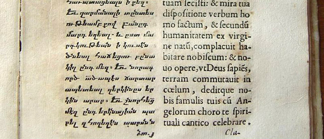
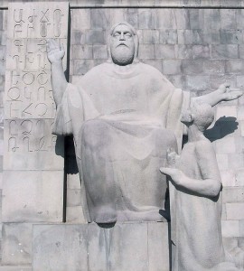
In 405 AD, Mesrop Mashtots, a monk in the Armenian royal court, was responsible for a critical landmark in Armenian history. Mesrop (or Mesrob in the Western dialect) was commissioned by the Church to devise a suitable alphabet to replace various types of cuneiform then used, in order to create a new written language to unite the population and make the scriptures available to them. He is said to have seen the letters in a vision from God – but I think it more likely to have been a great deal of diligence on his part. The original alphabet had 36 letters and was an uncial script called «erkatagir» or «iron letters».
Armenians value their literary heritage and and celebrate Targmanchats Day (or the Day of the Translators) each year. In October 2005, I was there for the festivities, which were even more important that year, because of the 1600th anniversary of the alphabet or «aybuben». At the heart of the celebrations was the fifth century church in the village of Oshakan, which was built to honour Mesrob and where he is buried. On the road from Yerevan to Oshakan, an enormous stone «Monument to the Book», featuring the alphabet, stands in open countryside.
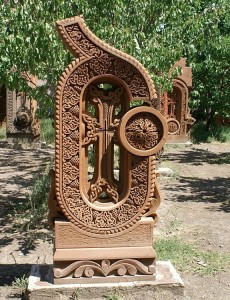
One of the 2-metre-high letter sculptures in the gardens of Oshakan Church, carved from Armenian red tufa stone in the style of the khachkars, or cross-stones. This is the «Sha».
For the celebrations, the churchyard featured the alphabet in spectacular ways – Mesrob’s thirty-six original letters cut from turf in the gardens. Also, waiting to be blessed by the Catholicos of All Armenians (the Church’s spiritual leader), stood the entire alphabet in the form of two-metre-high sculptures, carved from Armenian red tufa stone in the style of the khachkars, or cross-stones. In the evening, against the backdrop of another of the city’s ancient churches, a spectacular outdoor performance of drama, music and dance told the story of the alphabet – and St. Mesrop appeared in a cloud of smoke, experiencing his Holy Vision…
The Lettering Arts
Lettering is a different field to calligraphy or type design – hand-drawn, painted or carved characters, for example… There is a great deal of scope for artistic work taking the Armenian letterforms as inspiration and I have exhibited such work myself.
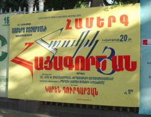
On that first visit to Yerevan, I was most impressed by the skillfully hand-painted canvas posters along the main streets which publicise events in the city. Sadly, they will soon be a thing of the past as they are disappearing, to be replaced by digitally-printed vinyl posters.
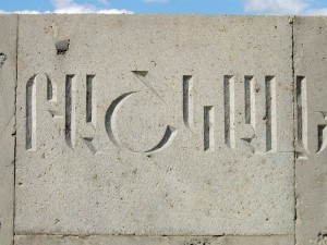
I saw evidence of the continuing tradition of hand-carved lettering all around Armenia. This craftsmanship is in evidence everywhere – a virtually indestructible mark of Armenian culture for future generations. The new City Hall in Yerevan, built in 2006, is an impressive pink stone building based on a series of arches which are still typical of Armenian architecture. On the pillar between each are expertly-cut inscriptions commemorating Armenian cities. Some houses feature individually carved tablets commemorating famous Armenians – the equivalent of British «blue plaques». So, the traditional art of letter cutting still flourishes throughout the country as can be seen on these and other public inscriptions, most poignantly on the Armenian Genocide Memorial in Yerevan.
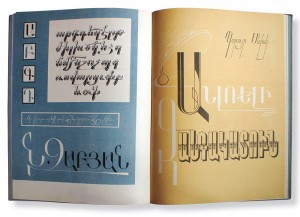
There are a number of albums published showing decorative and experimental lettering: Minas Minasian, a twentieth century Armenian artist in New York, experimented with the letters of his forbears and published a book of his works «The Armenian Alphabet» in 1979. «The Armenian Typefaces» is an album of the hand-drawn lettering work of Karo Tiraturian, published in Yerevan in 1963.
There are very few living Armenian artists noted for their achievements in this field. The best-known isFred Afrikyan, an architect who has explored the alphabet since 1961, combining his technical and artistic skills in hand-lettered works, executed with pen and brush to create what he refers to as «a sense and mood of beauty, love and harmony». He published an album of 120 of these «Tararvest» (Art of Letters) in Yerevan in 1984.
Typefaces for the Armenian language
Armenian manuscripts were becoming scarce in sixteenth century Armenia, to the consternation of the Apostolic Church leaders who felt their people should have access to the Scriptures, thus ensuring the continuation of their religion, so essential to the preservation of their culture. Mediaeval monastic libraries had been destroyed by invading troops of the Persian and Ottoman empires and foreign domination of the country made the introduction of printing to the Armenian homeland impossible for more than three hundred years after Gutenberg’s invention.
Armenian printing began in Venice in 1512 when Yakob Meghapart, a priest, published the first Armenian book, Urbatagirk, a prayer book. His types, with upright characters, resemble the script used in contemporary manuscripts of the time and may not have been cast but cut as woodblocks. Following this, the first metal types for the Armenian alphabet were part of the quest to make more religious books – The Bible in particular – available for the Armenian population. Several respected European punchcutters created the masters for the first metal types and it was Christoffel van Dyck’s work in the 1660s which finally enabled the magnificent Oskanian Bible to be printed in Amsterdam in 1666.
Nowadays, the availability of well-designed and readable digital type has a part to play in the cultural and economic development of Armenia. As Armenia becomes more closely connected to Europe and the US, the creation of Armenian typefaces with Latin characters included, has to be a useful development in forging those links.
Recent developments utilising the Unicode system and OpenType technology are crucial in this process. These offer an opportunity for a new way forward in good typography for Armenian speakers as they enable multi-script fonts to be installed on all computer platforms to function with various software.
Until recently, very few Armenian typefaces were available from digital type foundries, but now this is beginning to change and type founders are keen to include many non-Latin scripts in their offering.
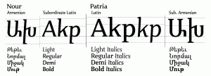
One of these is Hrant Papazian, whose US-based foundry The MicroFoundry specialises in non-Latin fonts. Papazian’s design «Nour&Patria» (Nour for the Armenian font, Patria for the Latin part) won first place in the non-Latin category of Creative Review’s 2006 typeface competition and the Grand (or top) Prize in the Armenian serif text font category of the Granshan type design competition in 2008. His latest type project is the Armenian component of Nina Stössinger’s «Ernestine&Vem».
Type design in Armenia
Henrik Mnatsakanyan, an artist and designer, founded the Type Design Laboratory in Yerevan in 1962, and was its Director until 1984. He developed over 100 Armenian typefaces over 50 years for both text and display until his death in 2001. During this time he published two books on Armenian Type in 1972 and 1979 – both well before the digital age. He has been the most influential designer in this specialist field and his designs have been the basis for a number of digital versions.
In 1973, Hayk Gortsakalyan produced a book about the Armenian Alphabet, lettering and type: «Haykakan taratesakner». It was published in Yerevan by the Academy of Sciences of Soviet Armenia. This volume is another which has been an influence on current Armenian type designers.
Manvel Shmavonyan is a graphic designer and type designer working in Yerevan. Shmavonyan worked with, and was taught by, Mnatsakanyan at ParaType in Moscow for a number of years and still considers him to have been the master of Armenian type design.
The most active person in developing type in Armenia itself recently must be Edik Ghabuzyan, who began to design typefaces twenty years ago. As a teacher of computing, Ghabuzyan began to build computers for his students to use and became interested in creating new typefaces to install on them. Recently Ghabuzyan has been designing modern Armenian typefaces using the advantages of OpenType to design the Latin, Cyrillic and Greek letters for his types. One of the most elegant of these is Mariam (from 2006–2007), which has now been adopted as the Armenian government’s «official» typeface.
Ghabuzyan now works for the Armenian Ministry of Culture as the head of the Department of Saving and Creating Armenian Fonts and has recently been acting as advisor for Armenian versions to enhance Adobe’s type library. It was he who instigated the «Granshan» type design competition to promote new type designs for the Armenian alphabet.
Another prominent Armenian designer is Ruben Tarumian, a qualified architect and a computer programmer, who has been active in the design of commercial types since the 1980s, creating one of the first Armenian computer types for Xerox Ventura Publisher in 1989. According to Shmavonyan, 90% of the types used in Armenia are his work – but largely as a result of font piracy, so as Chairman of the Association of Font Designers in Armenia, he is a keen campaigner against such practices.
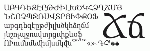
Modern Armenian types have become more «Latinised» – the shapes of some characters have been altered in weight and proportion – the x-height has been increased; terminals and descenders have been truncated and the traditional cursive style (based on the ancient Armenian scribes’ broad-edged pen-drawn forms) is less apparent. Adding features such as bracketed serifs to match European typefaces seems to be a slightly illogical addition and can cause confusion – but it can be argued that such designs may be necessary to create fonts to harmonise with existing commonly-used Latin typefaces.
Traditionally, Armenian type looks very different to Latin – the capitals are upright and the lower case characters are sloping; the x-height, descenders and ascenders are all of equal proportions. The traditional characters feature many laterally-projecting flourishes and descenders, which are unusual and appealing but create problems for even spacing. It is probably for this reason that the word spaces are much wider in Armenian text.
***
Last month, I joined the panel of judges co-chaired by Boris Kochan (President of the the Typographic Society Munich) and Edik Ghabuzyan in Dublin to judge the aforementioned type design competition «Granshan 2010». The winners of the competition were announced on the 29th September at a press conference held by the Ministry of Culture of the Republic of Armenia in Yerevan. These and other selected entries will be exhibited in Yerevan and Munich during October and November 2010.
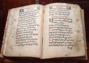
The very first Armenian-language printed book, «Parzatumar Hayots», printed by Yacob Meghapart in Venice in 1512.
The very first Armenian-language printed book, printed by Yacob Meghapart in Venice in 1512 was an important milestone in Armenian cultural history. That means 2012 is the 500th Anniversary of the book and there are plans to celebrate this in Armenia, as with the alphabet’s anniversary in 2005.
In addition, UNESCO have recognised this and at their Paris meeting in July, declared Yerevan to be the «World Book Capital, 2012» – only the twelfth city to be designated with this title.
The focus of Armenian type design has predominantly been text types, due to the Armenian interest in language and literacy – but there is certainly scope to design display type for improved promotional graphics in Armenian. So now as some of the world’s type designers are paying attention to Armenian type, perhaps it will become a «given» when designing multi-script typefaces. I certainly hope so!




Very interesting article, and good information about the history of Armenian alphabet rather than the language. I commend Nina for the courage and work. I’d like to add, why not offer all these letter types and styles as digital fonts to the public so we can use them in our presentations that we do in armenian?
Thanks, great read.
Great to know about the culture and letterforms through your article. Very Informative! Good work done by Nina.
Mary, there are in fact some crazy people who make fonts, yes… :-)
It just takes so long to do a good job, and there are so many great old designs worth digitizing, that we need all the help we can get. So, what do you say, would you like to try your hand at it?
hhp
2identify…
…