Archipelago
Stories about islands tend to be entirely too geographic.
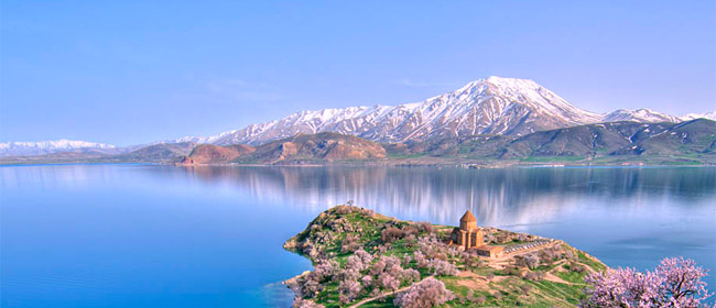
The Armenian nation consists of two islands: one land-locked, the other the size of Pangæa. Their relationship is similar to that of two other islands, Pluto and Charon: never touching, but completely interdependent; dancing at a distance, inseparable, unjoinable. The country Armenia touches no sea or ocean, but being surrounded by hostile states* is effectively an island. And the Armenian Genocide, which climaxed in 1915 resulted in the contemporary reality that out of a population of 10 million Armenians, 7 million live outside of Armenia.
* Except for a remote 40 km border with Iran triggering a friendship of convenience.
At least it’s not boring. And it touches our favorite subject: visible language. This sociopolitical flotsam & jetsam has given the act of reading in Armenian very different roles in Armenia proper versus the diaspora. And Armenian fonts are made very differently on the two islands. Until Unicode was taken seriously by us even the encoding of the characters was incompatible, a reflection of where one grew up: on the smaller, physical island the Armenian letters were relegated to the nether regions of ASCII, sometimes even having to share those tight quarters with Cyrillic! While on the very large, virtual island our letters were made to replace the Latin ones, on some level a desperate act of «what goes around comes around» poetic justice. Both of those were hacks (which however is much better than not being able to use Armenian on a computer) and the «international community» has now removed that particular border between the two islands – or at least given us the tool to dismantle the fence.
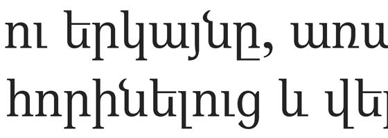
As for the look & feel of the letterforms in Armenian fonts, the ones made in Armenia are often heavily Latinized, to the great chagrin of some diasporan type designers, who are in turn often guilty of typographic hermeticism. It’s difficult to produce something that doesn’t make sense in one’s personal life, but that’s what Design must strive for: serving others. Although nothing made by a human can avoid personal expression, and nothing made for a human should avoid it, in Design –unlike in Art– personal expression must result in spite of oneself.

A revival of the cloyingly classical «Bolorgir» style, done by one Hrant Papazian before he knew any better
This difference between the two islands makes perfect sense. Although virtually all Armenians venerate our alphabet and its creator Mesrop Mashtots, for somebody living in Armenia the «design problem» is the paucity of exchange with the West; but for a diasporan the design problem is that Pangæa is dying: each subsequent generation is less adept at reading Armenian, never mind contributing to Armenian culture. And Pangæa must die. Although any people does and should have a diaspora, one that is larger than the homeland and detached from it is unsustainable; there must be a healthy churning between the two for a diaspora to survive, and for the homeland to truly prosper. Currently there is not nearly enough trust between the two islands to produce this churning, not least because during Armenia’s seven decades as a Soviet Republic cultural –and physical– exchange was nearly non-existent, and diasporan Armenians were raised in societies that disdained or ridiculed the USSR. The two islands have been free to intermingle since 1991, but old habits die hard. Stories abound of diasporan investors being fleeced; but some diasporans promote such stories to shirk their responsibility towards the homeland, limiting their support to summer vacations.
Back to type. Although good design is focused, the unprecedented level of exchange between the two islands enabled by the internet means that good Armenian fonts must serve as many Armenians as possible, no matter their geographic circumstance. The Armenian alphabet itself was invented to protect our future. This cannot be done by believing that Armenian type must limit change, but neither can it be done by mimicking Latin’s greatly successful forms. The former would cause the future generations to look at Armenian as a quaint idiosyncrasy, while the latter would cause them to see it as a pastiche of the «real thing»; neither leads to a motivation to create culture. Good Armenian type must look inside, look around, see a path, and take it. There is no progress, no survival, without risk.
Each island must risk a dependence on the other: designers in Armenia should continue becoming more international* without however riding roughshod over the natural needs of the Armenian script, while designers in the diaspora must remember where Armenian heritage is most secure and muster the courage to support our culture with progressive typefaces.
* As an aside, before the invention of flight Armenia was an important way station on trade routes between Europe and the East. It is an interesting paradox that the only thing that currently keeps Armenia in physical contact with the rest of the world is in fact what killed its cosmopolitan past; the Armenian city of Van for example was once a beacon of Near Eastern culture. And it is not ludicrous to think that Armenia would be on better terms with its neighbors if people couldn’t fly.
Homogeneity is death. There can be no culture anywhere with no pride in one’s own. However neither can a given culture make sense without the context of others. There must be a dynamic, competitive, optimistic balance. The ideal balance varies between individuals, and even within an individual over time. The central thing is to acknowledge the primacy of balance, the inescapability of Yin-Yang.
Every island is different, and can teach other islands how to live, and not. A solution for Ireland cannot be identical to one for Japan; the former is youthful and troubled in terms of politics and typographic style, while the latter’s ageing population and deathly fear of immigrants has given rise to the breakneck development of robots (which might become our most international citizens). This Armenian story can teach something to many, but we have more to learn in return. And hopefully one fine day the peoples of the world, and their designers, can realize the ideal cultural geography: an archipelago.
Note: This essay was originally commissioned by Dóra Ísleifsdóttir of the Iceland Academy of the Arts for publication in the journal Mæna.


I am assuming that the example of a «heavy Latinized» Armenian typeface as shown is being treated as something open to question. But in that case, people are going to wonder why a close historical revival of Bologir should also be classed as something one might do before one «knew any better».
I think that the course being recommended is neither a slavish following of the most popular foreign model, or remaining bound to traditional historical forms — but instead drawing on historical forms creatively, and being open to a wider range of foreign influences.
But this wasn’t mentioned, and this alternative won’t immediately occur to many readers without a typographical or other artistic background. Instead, they may just see rejection of the two most obvious choices, and end up being baffled as to which side you’re on.
1footstool…
…