Showcase: Calouste
Designed by Miguel Sousa
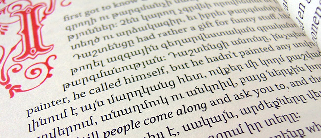
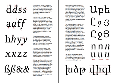
Designed in 2005 by Miguel Sousa in fulfillment of his Master of Arts degree from Reading University, the award-winning Calouste remains one of the very best Armenian fonts designed by a non-Armenian – and an exceptional effort irrespective of background. Miguel has since been recruited by Adobe’s type department and served as Chairman of the Jury for Granshan 2009.
Click the thumbnail to load the font specimen PDF:
Calouste has yet to be distributed, commercially or otherwise…


Very beautiful. What’s Hrant’s view on the extender length of the Armenian? It seems to follow the proportions of the Latin glyphs.
As Butthead would say: «Hey, you’re paying attention!» :-)
Please allow me to be a good host and delve into such gory details in an –eventual– Opinion piece…
hhp
Sure, I’ll look forward to that. I remember somewhere you’d written that Armenian proportions are in approximate thirds rather than having the x-height as the prominent section.
Calouste balances the two scripts remarkably well, to my non-Armenian eye.
Yes, it deserves much praise.
And it’s an interesting paradox that non-native eyes can play quite an important role.
hhp
Pretty impressive. It’s interesting to be digging into the details here… I’m enjoying the *very* slight slant in the Armenian, for example, and how it still matches quite harmoniously with the Latin (which seems totally upright to me).
> non-native eyes can play quite an important role.
I’d love to hear more about this, here or wherever.
Beautiful!
When will it be available for purchase?
Hrant, don’t be shy with the critic. Just keep in mind that this was student work and make sure you mention that you have really strong views about Latin-Armenian proportions. Nonetheless, I’ll concede that the proportions of the Armenian in Calouste do not work. One thing I realized towards the end of the project was that the relation between the cap height and the lowercase height of the Armenian was wrong. I didn’t have enough time to fix it, but if I were to do it again I would likely keep the lowercase height and increase the cap height, while keeping the Latin heights unchanged.
Khajag, hopefully someday, but to be honest I don’t know. I haven’t done any work on it since 2005.
The issue of proper vertical proportions across scripts is so broad and deep –going way beyond Armenian in fact– that attempting a treatment of the topic right here would be unfair and unproductive.
However I can and will take the opportunity soon, and yes it will be in the Opinion section. :-)
hhp
I’m also curious to know when this beautiful font will be available. Thanks.